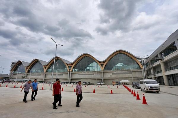
Cebu City Mayor Tomas Osmeña describes the design of the new airport terminal 2 as “unique and alive,” and has broken the convention of architecture design. CDN PHOTO/JUNJIE MENDOZA
THE beauty of the facade of the airport that stands today is a product of his constructive criticism.
Cebu City Mayor Tomas Osmeña said this on Friday amid allegations highlighted in a paid advertisement in a local daily recalling that the mayor had compared the design of the airport to that of a poultry.
Osmeña admitted criticizing the old design of Terminal 2 (T2) when it was presented in 2013, but he clarified that the statement pertained to the first design of the airport.
“But they’re trying to make it appear that [what we have now] was the original design. It’s not. They took up the challenge, otherwise, we would have the ugliest airport. It looked like a piggery, not a poultry. But they changed it,” he said.
“It’s nice. One of the best designs I’ve seen. But had I not pressured them and they did not take on the challenge, we’ll have the ugliest airport in the Philippines,” Osmeña said in a press briefing on Friday.
Osmeña described the design of the newly inaugurated Terminal 2 of the Mactan-Cebu International Airport as having a “unique and alive” design that had broken the convention of architecture design.
“If you are going to look at the biggest airports in the world, they all look like giant sanitary hospitals: concrete, glass, marble – so corny,” said Osmeña.
“This one is wood. Murag naay life ba (It seems to be alive). Look at the other airports, dagko kaayo no question. This one it has a nice touch especially if you are trying to get tourism,” Osmeña added.


